Sunday, November 4, 2007

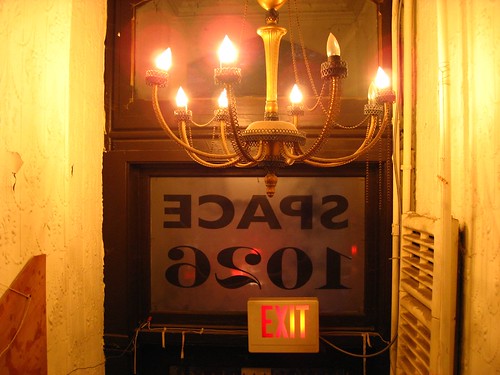
Philly / A few minutes at Space 1026

Flickr photo


I was in Philadelphia last Thursday evening, and I discovered that I was staying near Space 1026, a studio/gallery near downtown. Some artists from 1026 had some cool work in a show at Yerba Buena a while ago, I walked over and spent a few minutes walking around as the residents were setting up for the place's 10th anniversary party.

It's got a pretty great vibe; part punk club, part workshop, part hobo village. Situated above some retail space near the bus station, there's a nice open space in the front, but the majority is sectioned off into seven or eight (or more) mostly small studios densely packed with art supplies, knick-knacks, bikes, and other crap. I didn't get to see much, but I took some pictures of the various hallways and spaces so check em out.

Tuesday, October 16, 2007

Readings / Design, westerns, obsolete vernaculars

Thomas Allen - Fathom
This is a photo by Thomas Allen. I first noticed his stuff when I saw the covers of Vintage reissues of James Ellroy's novels (like this one for Suicide Hill). The photo above is from a series of dioramas that Allen created from cut-outs of 50's pulp novels. I love the use of the book-ends as textured underwater scenery here. Genius. Photo: Foley Gallery.


A lot of what I've been reading seems to resonate with my 9-to-5 work. Last night, I was reading architect Witold Rybczynski's account of a shed-building exercise that turns into a much, much more -- The Most Beautiful House in the World, and this passage jumped out at me, mostly because it spoke so eloquently of the stuff I value in design work:

The psychologist Bruno Bettelheim once characterized children's play as an activity "characterized by freedom from all but personally imposed rules (which are changed at will), by free-wheeling fantasy involvement, and by absence of any goals outside the activity itself" ...


Bettelheim quotes a four year-old who asks, "Is this a fun game or a winning game?" The solitary building game is a fun game--there is no opponent. The concept of fun is elusive and resists easy definition, but it is an undisputed element--perhaps the element--of play. In the present context, it is enough to note that fun does not imply folly or lack of seriousness--quite the opposite ... What keeps [the architect] involved for such long periods of time is that the outcome of the design process is unpredictable: it is the result of chance, as in play. He does not know ahead of time exactly what the result will be. He could save himself a lot of time and look for a similar building to reproduce exactly; but this would make as little sense as building the same house of cards again and again, or solving the same crossword puzzle. The issue here is not originality but fun.


The emphasis in that paragraph is mine.

This weekend, I was reading a New York Times feature on my man Robert Irwin, and I found myself smiling at this:

A favorite term is "participation." [Irwin] cites, for example, his 1997 transformation of a room that overlooks the Pacific at the La Jolla branch of the San Diego museum. Reasoning that he could not compete with the sweeping view, Mr. Irwin cut three rectangles —squares almost — into the existing windows. "At first I didn’t realize the glass was tinted," he said. "So not only did my holes let in air and sound, adding another dimension to the experience, but they made everything seen through them appear in greater focus." You might say he opened the window, that age-old pictorial device, letting in a cool rush of reality.


Once upon a time, I wrote a long post about Irwin's biography, Seeing Is Forgetting the Name of the Thing One Sees by Lawrence Wechsler; when I say that it blew my mind, I mean that the book expanded my mind, made me really think about the way I recognize, interpret and understand the things I see.

Finally: Cormac McCarthy. I'm reaching back in time, back to 1994, back to the night I disgustedly flung my copy of All the Pretty Horses out the window of my apartment. (Later that night, I saw the same copy for sale at 16th and Mission BART). Anyway, I'm willing to reconsider my judgment that McCarthy is no more than a smartypants Zane Grey writing for armchair gauchos. The Road stuck with me, really deeply upset me, and I respect that. So I'm giving him another try, and so far, so good: I got a nice copy of The Border Trilogy, and was quickly transported by the prose, though of course I was reminded of Owen Wilson's character Eli Cash, in The Royal Tenanbaums. His book, Old Custer, was written in what he characterized as an "obsolete vernacular," exhibited in this excellent bit:

The crickets and the rust-beetles scuttled among the nettles of the sage thicket. "VĂ¡monos, amigos," he whispered, and threw the busted leather flintcraw over the loose weave of the saddlecock. And they rode on in the friscalating dusklight. [More quotes from the Royal Tenanbaums]


Damn, that's good.

Tuesday, October 2, 2007

Photos / Found on FFFFOUND

Some great stuff on FFFFOUND, a social bookmarking service for images. It's in private beta, and I'll be curious how they maintain the current, continual high quality, as in images like this ...

Andrei Robu
Like this stuff by Andrei Robu.


Via kottke.

Wednesday, September 26, 2007

Lit / No room for anything but the old verities

The NYT book blog Paper Cuts recently published a nice entry about William Faulkner's late-in-life visit to West Point. It reminded me of one of my favorite moments from the (apparently out-of-print) Faulkner Reader: his acceptance speech for the 1949 Nobel Prize.

Reading it again this afternoon, this portion of his speech seems especially timely and eerie ...


Our tragedy today is a general and universal physical fear so long sustained by now that we can even bear it. There are no longer problems of the spirit. There is only the question: When will I be blown up? Because of this, the young man or woman writing today has forgotten the problems of the human heart in conflict with itself which alone can make good writing because only that is worth writing about, worth the agony and the sweat.

He must learn them again. He must teach himself that the basest of all things is to be afraid; and, teaching himself that, forget it forever, leaving no room in his workshop for anything but the old verities and truths of the heart, the old universal truths lacking which any story is ephemeral and doomed - love and honor and pity and pride and compassion and sacrifice.


The rest is here, on the Nobel Prize site. You can also listen to Faulkner's speech from the Nobel archives [requires Real Player].

Owl - Lantern in grass
A few weeks ago, I subscribed to an arty Portland blog called Urban Honking. Every couple of days, a photographer who goes by the name of "Owl" posts a few quiet, dark photos. This is one of them. As with Faulkner, I'm both jealous and inspired. Check out more Owl photos; it's totally worth it.

Tuesday, September 18, 2007

100 Northern California Hiking Trails

I stumbled upon a treasure trove of old outdoors books at Iconoclast Books in Ketchum, Idaho this weekend; this one's from 1970.

100 Hiking Trails - Cover
The cover ultimately doesn't make much difference, but I like this one.


100 Hiking Trails - Section
If only hiking through sun cups like these was as serene and lovely as the photo implies. Also, the introductory text instructs Yosemite visitors, "DO NOT FEED, TEASE OR MOLEST THE BEARS." Noted.


100 Hiking Trails - Trail
The page layout is classy, and the book is simple to navigate -- each set of facing pages describes one hike. Also, the map is intended as a thumbnail overview, not as the actual guide for use during the hike. (In 1970, maps could be acquired by sending $0.50 to the USGS.)


100 Hiking Trails - Detail
How do you know which map to purchase from the USGS for $0.50? The relevant USGS map ID information is in the top left corner of each page! Each hike has a summary that contains all the important stuff -- distance, elevation change, estimated time, and so on, ordered from most broad (and important) to most specific.


Wednesday, September 12, 2007

Baseball cards / 1960 Topps

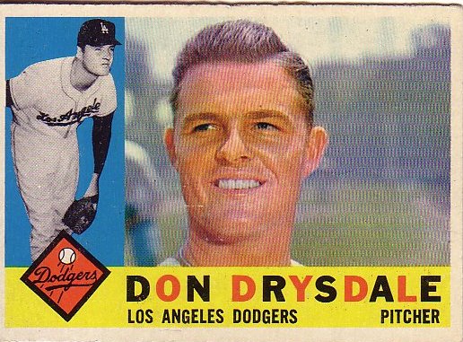
Like lots of stuff, they really don't make baseball cards like they used to. Halftone action thumbnail! Alternating colors in the player names! Don Drysdale's coif!
1960 Topps - Don Drysdale
1960 Topps - Curt Flood 1960 Topps - Elston Howard 1960 Topps - Don Larsen

Thursday, September 6, 2007

Clare Rojas at Gallery Paule Anglim

Lots of intriguing stuff at Clare Rojas's opening at Gallery Paule Anglim tonight. Woodland creatures, naked dudes in tai chi poses, an excellent video of Peggy Honeywell playing a slow sad song at a raging frat party filled with beer bongs and keg stands, Amaze, Barry McGee, and much, much more. Worth it.

Clare Rojas - It's hard out there for a penguin
I call this one "It's Hard Out Here For a Penguin."

Clare Rojas - Untitleable
I think this one is untitled, but it should be called "Untitleable."


Gallery Paule Anglim is at 14 Geary in downtown San Francisco.

Wednesday, September 5, 2007

Literary blogs / Paper Cuts

Cormac McCarthy adI've spent a lot time combing through the archives of Paper Cuts, the blog of the New York Times Book Review editor Dwight Garner. It steers clear of smartypantsness, focusing on what one might call the lighter side of serious literature. In fact, most of the content is on the periphery of the strictly literary -- a music playlist assembled by Miranda July, a quick, fun interview with Judy Blume, a scan of Jack Kerouac's obituary ("his subject was himself and his method was to write as spontaneously as possible"), a scan of an ad for Ralph Ginzburg's literary supernova Avant Garde that looks like the label on a Dr. Bronner's soap bottle.

Garner also has a podcast in which he interviews authors and reviewers from current and upcoming Book Reviews. Every once in a while, you'll suffer through some crap (e.g., Frank Rich gushing and giggling while furtively and unsuccessfully trying to hide the king-size man-crush he has on Don DeLillo). That said, most of the podcasts are informative and interesting.

The image at right is from a slide show of advertisements that appeared during the "golden age" of the NYT Book Review -- 1962-1973.

Foto / Modernity in Central Europe

Foto - Modernity in Central Europe
When I was in Washington DC last month, I saw an incredible show at the National Gallery called Foto: Modernity in Central Europe 1918-1945. As you may have guessed by the title, the show is photography-oriented, but it's more than that: It's a story about photography craft, and the way that European photographers bent, broke and otherwise manipulated photos to express the social, political and cultural fragmentation (and chaos) in the wake of the First World War. Most of the artists were unknown to me; they're all introduced and discussed in detail in the excellent exhibition catalogue. It opens at the Guggenheim New York in October.

Birth of a robot
This is a photomontage by a Polish artist named Janusz Maria Brzeski. It's called Twentieth-Century Idyll, but the name of the series is even better: A Robot Is Born. Photo: National Gallery of Art.

Jindrich Styrsky - Souvenir
Another photomontage, this one by Jindrich Strysky, a Czech artist. Photo: National Gallery of Art


Tuesday, September 4, 2007

Cuban cashola

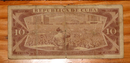
Flickr photo
Fidel doing what he does best: Moving the crowd.


I traveled to Cuba 10 years ago this summer, and I unearthed this 10-peso note when I moved earlier this summer. Coincidence, or a sign that I should return sometime soon?

When I was there, the official exchange rate was one American dollar to one Cuban peso, but one could get 20 Cuban pesos with one American dollar if one exchanged money on the street. It appears that this hasn't changed, though Wikipedia notes that Cuban pesos have no value in currency markets.

When I was there, Cuba was still reeling from the collapse of the USSR, and accommodations were made to handle the hardships known of this Special Period. For example, the American dollar could be used to purchase "luxury goods," though at that point "luxury" involved eating chicken once in a while and drinking an occasional beer. They've since introduced a second currency to replace the American dollar, the convertible peso, while keeping two tiers of goods. Yanqui go home!

Just Expect To Be Left Utterly Enraged

Flickr photo
My cozy bed between Herman Miller chairs at Dulles.


News flash: Air travel really sucks right now (Washington Post). A couple of weeks ago, I too was touched by this national nightmare. On a Friday evening, I planned to fly from Dulles to SFO, but got slapped with an SSSS on my boarding pass (expired driver's license) and a long security line and figured I would miss my flight. Good thing it was delayed. For three hours, initially. The gate agents reported that there was bad weather in New York, and this seemed reasonable to me because there were lots of people at the other gates who appeared to be pissed off and tired. Also, the storm was all over the hundreds of TVs that blast CNN at you. I got comfortable and watched an excellent movie (Kurosawa's The Bad Sleep Well) on my computer, fully believing what the gate agents were saying: The flight would not be canceled. They emphasized this: It would not be canceled.

After two more delays, at 2:30am, the gate agents delivered the obvious: The flight would be canceled. Within milliseconds, an entire plane-load of people freaked out, fumed, growled, shouted insults and then scrambled to get re-booked. Lines at the desks: 45 minutes. Hold time on the phone: 45 minutes. Likelihood of getting out of DC in the next 24 hours: Zero. Compensation for our trouble: Zero. Our flight appeared to be the only suckers left at Dulles, but of course the airline blamed the cancellation on acts of God and air traffic control and, on those grounds, they refused to give us even a voucher for a soda. (A recent Washington Post article examines traditional airline excuses).

But wait, there's good news: The current issue of Popular Mechanics has an article about the FAA's work on a GPS-based air traffic control system, which will be up and running by ... 2025. Ugh.

I won't name the airline (because I am a gentleman), but I encourage you to look for clues in the title of this post. (Specifically in the first letter of each word. Thx, Khoi Vinh for the inspiration.)

Thursday, August 23, 2007

Summertime / Camping in the Winds

Flickr photo
When I start a camping trip, the Van Halen song "Panama" [Video on YouTube] often pops into my head -- I wish I could represent Eddie Van Halen's reverby guitar opening in words, but I was humming it and singing the chorus -- Pa-neh-ma ... Pa-neh-ma-ha -- as this picture was taken. That's the Wind River Range coming into view beyond my friend Nick. For the next 10 days, it would dominate us. In fact, this photo represents the last few moments of peaceful hiking. Our packs were really, really heavy, and soon enough the hurt would begin. Then, we would get rained on pretty often, and (for my part) suffer too many black fly bites and a few altitude-related headaches. Still, totally, totally worth it.


Flickr photo
I could go on and on here, but my pictures on Flickr really tell the story better than I can.


I'm a shameless sucker for gear, so here's some shout-outs:

  • Bridgedale socks. They were really wet, really often. But they stayed warm and they maintained some spring, even when soaked.

  • Tarptent. I visited Tarptent designer Henry Shires at his house on the Peninsula, and I bought the Squall [PDF] last spring. Since then, I've put it to the test in the Gila Wilderness, Yosemite, and the Yuba River. I was still skeptical about its ability to really keep me warm and dry, but I must testify that, even when it rains hard all afternoon (and even when the rain really comes down), the Tarptent abides. Everything people say is true: It's a really good, reasonably light backpacking shelter, and it's got everything you need to anchor and adjust it to respond to changing weather and wind.

  • Blistoban. Part of the reason for the shout-out to Bridgedale was that, halfway through, I switched to thinner Smartwool socks, and they absolutely killed my feet in the matter of a couple of hours. Nick loaned me some Blistoban strips, though, and they ruled. How does Blistoban compare to my old backpacking blister-control remedy: antibiotic ointment covered by bandaid which is then covered by duct tape which is then smeared with Vaseline? Jury's still out here.

  • Patagonia Dragonfly. They call it the Houdini now, and it's a little different, but I bought one of the early models in 2003, and it still impresses me. I wore it almost everyday, and it admirably repelled rain without ever becoming oppressively warm.


UX / Flickr pisses me off

My Flickr pageYes, I appreciate Flickr. After all, it allows me to store my photos online, share them with others, and display them on my website. Yay. Thanks for that. Still, it frustrates me daily. Here's why:

Sequence of photo display is set in stone
If I drag a dozen pictures into the Flickr Uploadr, God only knows the order in which they'll appear on the site. But I care about the order in which they appear on the site, because the LAST photo uploaded ends up being at the top of my Flickr homepage, and in that position of prominence it says something about me. It annoys me that I can't control this more.1
Little control over homepage layout; no way to make stuff sticky
So, if I can't control the order of uploading, can I control what's displayed on my Flickr page? No. Can I make a set sticky, so that it stays at the top of the list? No. Can I display only sets? No. Of course, Flickr has introduced new layouts, but all of them are simply ways of arranging the most recent stuff. Not helpful to me.
No concept of new-to-a-user
I'm thinking of my grandparents here. Wouldn't it be nice if a meta-set (or something) was created of stuff that's new to the viewer? I could just create a bookmark here, and they could check for new stuff.
Tagging is a royal nightmare.
Maybe no one has totally solved this yet, but here's something that would work for me: I usually upload multiple related pictures at a time, and these pictures tend to share a lot of the same tags. So I'd like to create small groups of tags for a groups of pictures, and then quickly drag and drop, or multi-select and apply, a tag to a subset of those pictures. del.icio.us's tagging interface is rudimentary, but it's vastly more helpful than Flickr's:
What del.icio.us does well in tagging


The navigation confuses everyone except geeks and experts
Collections? Sets? Archives? What's the diff? As my mom once asked me, "Where are the albums?" At the risk of sounding irretrievably old-school, this particular set of grouping concepts is a frustration to cognition. (Also, if the distinction is made in this navigation area, why aren't the things (sets) in the right column labeled as such?)
Flickr secondary nav


No record of blogged pictures?
When I create a blog entry from a picture, why isn't there some kind of record that the image has been blogged? A link? This just seems so basic to me.

1 Interesting side note: I bumped into some Flickr people at CHI, and I asked them about this. Their rationale: The photostream is what Flickr is all about, and the strictness of the sequence is a useful governing principle. Umm, yeah. Flickr people may think of uploading as a continual stream, but I upload photos in clumps -- I don't always think about my photos in the terms of the last photo uploaded, I often think in terms of the last group. I feel like I should have control over the way those clumps are displayed. If you force me to always show the most recently uploaded individual photo, shouldn't you also give me some control over the order of upload in your Uploadr?

Tuesday, August 21, 2007

Washington DC / Fortress of democracy

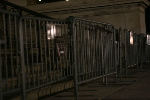
If the government buildings are any indication, Washington DC is a city bracing for something. Makeshift barriers surround the Capitol; men with automatic weapons stand watch over random governmental doorways and intersections. Sure, this is no different than other “significant” places in the Western world – London and Frankfurt have their share of fortresses and sentries – but as a citizen and idealist I’d hope that Washington would be different. I'd hope that *we* would do it differently.


Flickr photo
Our lawmaking buildings were designed to be approached: Sitting at the head of the Mall's long runway, the Capitol Building inspires further investigation. Nowadays, if a person (say, me) decides to take a picture of the fences around this beacon of democracy, that person may get reprimanded by a guy with a gun. I'm just saying: It happens.


Anyway, I hope that we'll search for solutions to the problem of security that don't run counter to the ideals of democracy: that lawmakers operate in the open, that anyone can see how it’s done (and indeed that everyone should see how it's done), that people are innocent until proven guilty, and that I'm paying for those fences, dammit, so I should be able to take a picture of them without getting harassed.

UPDATE: Even the new $50 bill emphasizes the approachability of the Capitol.


50 dollar billCheck out the little white figures climbing the steps on the left-hand side of the Capitol building. This seems to imply, to me, that people can (and should) walk up the stairs to see what's happening within the hallowed halls of democracy.


Adaptive Path UX Week / One of ux, one of ux1

I attended (and spoke at) my first UX Week last week in Washington DC, and it lived up to its billing as a good ol’ time. I met many amazing people, stayed out too late, and yet was still motivated to get up early every morning to see the keynotes. That’s saying something. Most conferences can be considered successes if just one of those things happens.

UX Week 2007 Program
The UX Week program with my lucky cat.


Breaking it down
The sessions came in three varieties: (1) products and interface implementations; (2) design tools and processes; and (3) ideas and inspirations. Sarah Nelson at Adaptive Path organized the conference, and she recruited speakers who were not the usual talking heads.2 The mix of backgrounds, experience, and subject matter kept things lively. I especially appreciated the discussions of process by AP folks like Indi Young, Kate Rutter, and Jesse James Garrett during the panel discussion of CNN.com. All of these opened my eyes to new design tools and techniques, and exposed the fact that there is a lot of innovation going on out there. In terms of the flashy products on display, I'm inherently too inquisitive and skeptical to believe what people tell me during product demoes -- I need to get immersed in them myself, and ask: How did you get there? Where did that come from? What need is that addressing? How did the design evolve? Because I'm a nerd.3

Design is story-telling
As Leisa Reichelt pointed out during our panel, a lot of speakers addressed the topic of story-telling in one way or another. Kevin Brooks of Motorola Labs led a workshop on storytelling techniques; the folks behind the recent redesign of CNN.com described the way in which they crafted the story that they told their internal stakeholders; people from BestBuy.com and Sachs discussed the use of videotaped customer stories to make a case for a redesign. Of course, story-telling and design are intimately intertwined -- two strands of a businessy double-helix. I was inspired by the variety of ways in which designers are telling stories about the problems to be solved, and the techniques and nuances involved in their approaches.

UX is real
I go to fewer conferences than I should (so I may be a bit sheltered), but I'll say this anyway: at the conference, I got the feeling that UX was much further along to becoming an actual profession. UX practices are no longer outposts in the Wild West of digital products; our work is now identifiable territory in the business landscape. Not long ago, there were very few things that wouldn’t be considered within the purview of user experience; now, the boundaries of our problems are a little more clear, and our experiences as practitioners have more commonalities than differences. I feel like Tom Hanks in Big.

Now, if only I could explain what I do to my parents ...

1 From one of my favorite movies of all-time, Freaks, i.e., one of us, one of us, we accept you, one of ux.
2 Okay, except Jared Spool, but it's always good to hear what he's thinking.
3 I admit: The interface for One Laptop Per Child is elegant and intriguing, but I'm politically ambivalent about the project itself. I'm fascinated by the possibilities of creating an information pipeline the developing world, but I guess I'm not enough of a tech evangelist to believe in the idea that distributing laptops is better than distributing more immediate aid. Maybe I'm not thinking big enough.

Monday, August 20, 2007

756 / I was there

I’ve said it before: I don’t like Barry Bonds. So it may seem strange that I wanted to be there when he hit home run number 756. But consider this: I love baseball; the record for career home runs is, like it or not, one of baseball’s hallowed milestones; Bonds plays in my city; the Giants were beginning a home stand as he was poised to break the record. Too many stars were aligned for me to NOT try to get into a game. I could always boo, right?

So, on Tuesday, August 7, I rode my bike to AT&T Park, hoping to get lucky and figuring that I wouldn't. Immediately, I got really lucky, scoring an amazing ticket in the club level (a $70 value) for the price of two AT&T Park beers. At that moment, I had a good feeling. A couple of hours later, Bonds faced a 3-2 count, and I decided to join 45,000+ other fans in pointing my digital camera at the plate. Up to that point, I made sarcastic remarks about mediating the experience in that way. Now I’m posting my crappy version on the Internet. Why? I don’t know. Anyway, a moment later, Bonds drilled the pitch into deep, deep center field and the stranger next to me grabbed my arm and started jumping up and down.


Here's the video that I shot with my digital camera. (Warning: It's bad. And bouncy).

For the next five minutes, I high-fived a lot of people, and someone gave me a hug as I was filming the celebrations. Fireworks exploded over McCovey Cove; streamers rained down; the Nationals left the field; Hank Aaron congratulated Bonds asynchronously through a pre-recorded video. It was surreal, but festive and exciting.

Of course, there was also a weird vibe. People seemed to feel personally gratified that they got to witness history, but few seemed really, truly happy for Bonds. Few people said: “Wow, good for Bonds.” Those who did were either people who possessed amazing capacities for forgiveness and seemed genuinely happy, or younger guys with way too much bitterness who saw Bonds as a kindred spirit. The rest of us said: “Wow. I can’t believe I saw that. Wow. This is really weird.”

After hitting the home run, Bonds left the game. It was the 5th inning, and the Giants had a 5-4 lead; the Nationals came back and won. My question: Who does that? Hank Aaron? No. Dimaggio? Never. Ted Williams? God no. Sort of a perfect ending to a conflicted, surreal night.

Monday, July 9, 2007

Worms ate my garbage

Worms Eat My Garbage Mary Appelhof's Worms Eat My Garbage is one of my all-time favorite gardening books. Not only does it contain the first principles of worm composting; not only is written in an engaging, warm and yet practical voice; it's one of those special books that says a lot about the person who displays it on his or her bookshelf, a freak flag representing all sorts of affiliations, opinions and predilections.

I was thinking about Mary after I read a strange tidbit about worm composting in today's Wall Street Journal Informed Reader blog. It linked to an article in Britain's Daily Telegraph called "Wormeries 'may add to greenhouse gases.'" Hmmm.

In fact, the greenhouse gases emitted by a large commercial worm composting plant may be comparable to the global warming potential of a landfill site of the same scale, according to the Open University. This is because worms used in composting emit nitrous oxide - a greenhouse gas 296 times more powerful, molecule for molecule, than carbon dioxide. Landfill sites produce methane which is 23 times more powerful a greenhouse gas than carbon dioxide.


What is this Open University? (Apparently, it is a "distance learning" program in the UK). And how much nitrous oxide do worms emit as they consume garbage? Is it comparable to the amount that the garbage would emit if it sat in a landfill? Is it less? More?

(Mary's website? www.wormwoman.com, naturally.)

Saturday, July 7, 2007

Classic NBA / Red hot and rollin


If you're 35-ish and you've followed basketball, you probably recall the virtues of the pre-David Stern NBA, the simpler times when corporate logos were incidental, local heroes more accessible, and the entire sport more truly fan-friendly. Stern always talks about fan-friendliness, but his NBA is a Product and the "friendliness" seems as produced as two-for-one chalupa night. Back in the day, a young Kansas City Kings fan could attend Kings practices at a local high school (for free), and afterward mingle with players like Ernie Grunfeld, Phil Ford, and Otis Birdsong. It goes without saying that most fans would take that over a free chalupa any night.

Red Hot and Rollin recaptures the simplicity and beauty of those times. Edited by Matt Love, it compiles a variety of recollections of the Rip-City-era Portland Trailblazers, and includes a DVD of a truly amazing document of the time -- Don Zavin's Fast Break. Zavin's film is astounding in many regards. Primarily, it's a bittersweet meditation on a lost NBA -- the League before each player became a corporation unto himself, and before the entire visual experience of watching an NBA became NASCAR-ized with layer upon layer of corporate logos. Moreover, it's possible that there is no team in the history of the NBA that is as antithetical to Stern's NBA than the Blazers of 1976-77: a small market team without a marketable superstar, led by a vegetarian, Marxist, long-haired, Abe-Lincoln-beard-wearing center who stuttered when he was nervous.

The form of the film could be called "stoner verite." With a soundtrack that is basically an extended tabla jam, it's a documentary in the tradition of, say, Endless Summer with the crucial difference is that it's unburdened by Endless Summer's linear narrative and omniscient narration. I won't give it all away, but it wanders through some amazingly intimate glimpses into the Blazers' ecstatic run to the NBA title, for instance ...

Walton rides up the coast
This is former Blazers star Bill Walton on a classic Falcon racer. After the Blazers won the NBA championship, Walton took a bike trip up the Oregon coast, and scenes from this trip are interspersed throughout the movie. Again, could anyone imagine ANY current NBA star going on a bike trip alone during the off-season? Where are the entourages and Escalades and hotties? It's also sort of amazing to see an NBA superstar engaging in an activity that non-superstars find enjoyable. Where are the strip clubs and casinos, the handguns and hot tubs? (You can't really see in this photo, but the bike's color is Falcon's tell-tale powder blue. Awesome.)
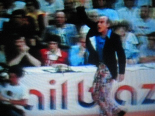


Doctor Jack pantsYes, this is Dr. Jack Ramsay, and yes, his pants appear to be some kind of psychedelic red-white-and-blue crazy quilt. Look out, Larry Brown.


Walton is mobbedThis is actually the third time in the movie that Bill Walton ended up in a mosh-pit of fans. The fact that this would never, EVER happen today is part of what's so bittersweet about Fast Break.


Some related stuff: A classic Time feature of Walton as a UCLA senior from 1974 called "Basketball's Vegetarian Tiger," a nice review by TrueHoop's Henry Abbott (a Blazer fan) that includes a quick interview with someone who worked on Fast Break, and of course, you've got to see this one: Walton's epic dunk over Kareem in the Western Conference Finals. [YouTube]

Wednesday, June 27, 2007

Dream come true / My Simpsons character

Simpson LeMoine
Thanks to a tip from fellow Simpsons fanatic and Cooper colleague Chris Noessel, I discovered that I could generate a Simpsons character with my likeness on the Simpsons Movie site. Holy crap. Truly, a dream come true. Now the only thing left is to have my likeness drawn in the Wall Street Journal "hedcut" style [a PDF on the Dow Jones site about how pictures become WSJ-ready].

And it's me, right? Except there were no options for beards, which is strange considering that there are quite a few bearded Simpsons characters. Homer's got a perpetual five o'clock shadow; God has a flowing white beard; Hyman Krustofski has the impressive ZZ Top-style beard befitting a cartoon rabbi; Dr. Marvin Monroe has a beard that is more like mine. So there's got to be lots of existing styles to choose from.

When I did a Google search for "simpsons beard," I discovered that Simpsons creator Matt Groening is a self-described beardo, as revealed in this email chat from 1993: "I've been mistaken more than once for Stephen King, Leonard Maltin has been mistaken for me, but I think I look more like a bearded hippie verson of Homer Simpson." (This chat took place on Prodigy, of course. Wow. Simpler times.)


Thursday, June 21, 2007

Yosemite rules

I'm usually the person who recommends going anywhere but Yosemite in the Sierras because it's expensive and tends to be over-run with people even in the high country, whereas the Emigrant Wilderness, for instance, tends to be pretty sparsely visited, even on the busiest of weekends. But let's keep that on the shhhh. Anyway, I spent 3 warm, sunny days in Yosemite last week with my good friend and all-around good guy Andrew Goodman.

We had nice weather, went to popular places (North Dome, Yosemite Falls -- which has its own Wikipedia page), and yet saw very few other people. Maybe it's the time of year, or the fact that it was a low-snow year, or both? Or our route? We hiked down to North Dome on the Porcupine Creek Trail, and then got back to 120 via the Yosemite Creek trail (where, incidentally, we took some excellent swims). Whatever contributed to it, I've now seen the good side of Yosemite.


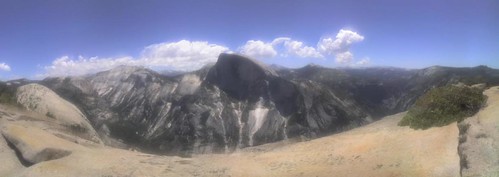
Flickr photo
Yosemite Valley from North Dome, rendered via the magic of Autostitch. It assembled 25 or so photos from my Motorola SLVR into a pretty complete panorama, and even the artifacts -- moving clouds and ghosted edges -- seem to make the result more compelling, I think.


Yosemite in the Sixties - Glen DennyYosemite Valley is an incredible place, especially when seen from a place above the Valley, like North Dome or the outcropping above Yosemite Falls. If you want a glimpse at the Valley was like when people were putting up the first routes on El Cap, check out Glen Denny's photo book, Yosemite in the Sixties. It's really nicely produced and filled with amazing black-and-white images of simpler times and the legends who started it all -- Yvon Chouinard, Warren Harding, Royal Robbins, Galen Rowell, and many more.

Monday, June 18, 2007

Absolutely, positively time for a new wallet

Years ago, I tried to make a wallet out of a Fedex Tyvek envelope, based on instructions from the inaugural issue of Readymade magazine. I liked the idea of a super-slim wallet that was (a) really cheap without seeming (b) totally cheapskate. The problem was, as simple as it seemed, making the thing involved a sewing machine, a device that is actually somewhat hard (not to mention scary) to use. So I gave up on the idea of having one until about a year and a half ago when I saw one for sale on Etsy for $5.

Fedex wallet
This is my Tyvek wallet after 18 months of use. When I bought it, I figured that it would last for a couple of months before it fell apart, but I was pretty amazed at how well it held up without much outside assistance other than a couple of layers of packing tape now and again.

As long as we're talking about Fedex, here's the cool 70's Fedex logo, and one of those 80's ads with the fast-talking businessman [YouTube]. Next up: a relatively inexpensive wallet from All-Ett that uses silicone-coated ripstop nylon. Doesn't have the cool DIY look of the Fedex wallet, but seems a lot more durable.

UPDATE: Just got email from Terrence Kelleman at Dynomighty Design, who designed a wallet made from a thicker, more durable grade of Tyvek and which is held together by gluing and folding rather than stitching. No sewing machines: bonus. Check out his demonstration [You Tube].

Tuesday, May 29, 2007

San Francisco / Maps and earthquake shacks

San Francisco in Maps: 1797 - 2006This weekend I got an incredible book about San Francisco called San Francisco in Maps & Views. I usually avoid glossy coffee-table historical books because they're so often filled with disappointments -- bad color, bad printing, messy layout, uninspired writing, PLUS they're really expensive. But THIS ONE. This one is different. The maps are very well-reproduced, high-res and colorful, and all are supported by detailed and surprisingly engaging commentary.

After I got over the initial thrill of using it like a flip-book and watching my neighborhood evolve, I started to notice smaller trends in land-use evolution -- a plot labeled "orphan asylum" became "hospital;" many things labeled "cemetary" became "park" or "civic center." "Dunes" become "the Sunset."

I was also intrigued by the use of public places as refugee camps after the big one hit in 1906. Apparently, SF carpenters sprang into action and built thousands of makeshift cottages for the earthquake/fire refugees, turning many well-known SF public spaces into refugee camps, including South Park, Dolores Park, and Precita Park, and lots of the then-outlying, undeveloped areas, like the Richmond and the Sunset.

Earthquake_shacks_in_Dolores_Park
A shack on Bikini Ridge would have been puh-retty sweet. (This is Dolores Park, believe it or not). Photo: Western Neighborhoods Project

As the city began to return to normal a year later, a few of the refugees decided to use the cottages -- or, "shacks" as they were commonly known -- as more permanent residences. Some industrious people combined multiple shacks into one residence. Incredibly, a few shacks are still around, and naturally folks have organized to preserve them. (Here's a 2002 Chronicle article about efforts to save some shacks in the outer Sunset).

Cumby_shack
I believe that this is the house that is listed as 300 Cumberland on the Western Neighborhood Project's list of known shacks. The crazy thing is that this is at the top of an insanely steep hill, like un-bike-ably steep and long, so it must have been built there rather than transported from Dolores Park. On the other hand, who knows? People were crafty back then, right?

Finally, here's a map of the locations of the known existing earthquake shacks. Seems like a good project for a weekend afternoon.

Google street-view meets new apartment

Mara and I just moved into the Lower Haight earlier this month, and Google just released a new Maps feature -- Street View -- that has a picture of our place. If I weren't writing about this, I'd be speechless. Wow.


Our new place on Fillmore
Our place is the yellow two-story walk-up that is bustin out of the top of the frame. I love that it was captured on one of those semi-sunny days where little wisps of fog drift through. So nice to not live in the fog belt. Incidentally, here's the Chronicle's fog forecast. Doesn't look good.


Street Level seems like useful functionality, esp. for fancy mobile devices, which I don't have. The controls are pretty straightforward and easy to use on a desktop, but I wonder about the ease with which one could navigate up and down the streets with those teeny arrows on a Palm or Blackberry. This is really nitpicky, but I think it would be effective to introduce more map navigation into the image, i.e. skipping to the next intersection, returning to the original destination, etc. Future-wise, it would be awesome to be able to do stuff with the images -- easily insert them into other things, string them together in connection with directions, etc.

What I want to know is: How the heck did they do it?

Thx, kottke.

Wednesday, May 23, 2007

Must-see movies / Killer of Sheep

Leaping boy from Killer of Sheep
A moment from a beautiful, riveting scene in Killer of Sheep. Photo: Milestone Films.

Killer of Sheep is director Charles Burnett's account of life in the LA neighborhood of Watts in the early 1970's. It began life as his senior thesis at UCLA film school and until recently it was never seen outside art houses and museums. Despite all of that, it was among the first 50 films to declared national treasures by the Library of Congress. I saw it earlier this week at the Castro, and it lived up the hype.

Burnett's account of his motivations in making the film seems like a good place to start unpacking the stuff that makes it so unique:

I wanted to tell a story about a man who was trying to hold on to some values that were constantly being eroded by other forces, by his plight in the community, and the quality of the job that he had. At the same time he wanted to do right by his family. I didn't want to impose my values on his situation. I just wanted to show his life. And I didn't want to resolve his situation by imposing artificial solutions like him becoming a doctor or a diplomat, when the reality is that most people don't get out. I wanted to show that there is a positive element to his life, and that is that he endures, he's accepted it. [From an excellent interview on Senses of Cinema]


To bring this story to life, he employs a style that seems improvisational, as much documentary as Italian neorealism. But there's also something very new and genuine and particularly American about it -- isolation, crumbling buildings, explosions of cruelty and anger, and the constant, chaotic motion of kids leaping across rooftops and crawling under buildings -- combined, these things seem to evoke a very American way of poor, urban life.

More than anything, the movie makes you wonder at its very improbability: How in the world did he make that? Did he actually plan those moments that seem genuinely serendipitous?

Maybe it's that the actors are untrained. The dialogue seems fresh, surprising and authentic even when it's forced. Maybe it's the pacing of the editing. Scenes start abruptly -- children emerge from a hole, an entire neighborhood has assembled in a stairwell, kids hide behind a scrap of plywood. Most scenes also tend to end a couple of seconds early, or linger a few seconds longer. Maybe it's the dialogue -- it's all mumbles or hollers or growls, with jazz and blues tracks adding rhythmic, sometimes hopeful counterpoints to the imagery. Who knows? What's clear is that it speaks in a true, clear and unique voice. Go see it.


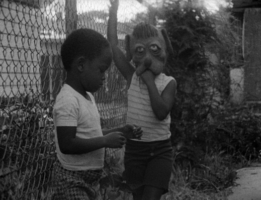
Dog face in Killer of Sheep
No dialogue. Dog mask. Chain link fence. Killer of Sheep. Photo: Milestone Films.

Weekend reading / Nuclear war, office drama

The Atomic Bazaar: The Rise of the Nuclear Poor

I came upon the work of journalist William Langweische in pre-Internet times, reading a faded and dog-eared photocopy of "The World In Its Extreme," a series of Atlantic Monthly articles that trace his travels across the Sahara desert. A vivid scene leaps to my whenever I'm in an airplane: He is on his way to a remote Sahara outpust, flying at a low altitude above the sweltering desert in a rickety old plane and surveying an endless expanse of what appears to be nothingness. I think of this as I pass over (my homeland) the Midwest. Like the Midwest, he finds that it's only mostly nothingness, that there are actual inhabitants and real-life oases, and his accounts of the people, places and cultures are really riveting. (He expanded this piece in a book called Sahara Unveiled).

Langewiesche's new book, The Atomic Bazaar, was the cover story of this week's NYT Book Review. I have no doubt that it will be great, even though the topic is one that I'd almost prefer to think about less: The circumstances under which a group of terrorists could acquire highly enriched uranium and then build a bomb. If you listen to these NPR interviews with him (part one; part two), you get the sense that it's a lot easier than it should be, but that the likelihood is still there. Now that the book is out there, I know I have to read it.

Joshua Ferris, Then We Came to the End
Then We Came to the End: A NovelEarly this week, I plowed through Then We Came to the End, the debut novel of Joshua Ferris. It's a book about office life at ad firm in the early 2000's, specifically about how the fat, happy days of the late 90's give way to the slow, scary days of the early 2000's. In a nutshell, reality crashes into the fairytale; normalcy is shattered; there are efforts to deny the inevitable; the inevitable happens; a new normalcy is eventually erected amidst the rubble. It's good, though: Lots of interesting, authentic characters, funny dialogue, a few geniunely moving moments.

Geeks will appreciate that the novel is written in first-person plural omniscient, meaning that the story is told from the point of view of "we," but the identity of the "I" behind the "we" is never established. It works, I think. After 50 pages or so, I thought to myself: "Is he really going to keep this up for the whole book?" But Ferris never gets cutesy with it, and it effectively evokes a very office-like sense of disassociation, of total incorporation into the whole, of membership in a group that has completely assimilated the identities of its constituents.

Tuesday, May 22, 2007

Rachell Sumpter / Ethereal, still, and strange

rachell_sumpter_argonauts
Rachell Sumpter, Argonauts. From her collection at the Richard Heller Gallery.

Her stuff reminds me of lots of other artists I like -- Evah Fan and some aspects of Julianna Bright, for two. Maybe it's something about the West Coast, but they're all simple and light at first glance, but also deeply still, and it's a stillness that reveals something surprising, impossible, or discomforting, but in an amusing way. Usually. Anyway, there's lots more Rachell Sumpter prints and stuff at Little Paper Planes, and some drawings, prints, watercolors and more from a 2006 show at Sixspace.

Thursday, May 17, 2007

Warriors / Drama, elevation, a posterization, terrible officiating

The Warriors playoff ride is over, the Jazz's ride will come to an end sometime in the next week or so, but Baron's dunk over Kirilenko will live on FOREVER. Let's just sit back and appreciate it for a minute. (It's much better live).


the rise-up
Baron elevates and elevates; he begins his leap before Kirilenko and is still going up as Kirilenko descends. Mind-bending. To his credit, Kirilenko said after the game that it was an awesome dunk and that "at least I got to be on the poster." Also to Kirilenko's credit, he didn't foul Baron; if anything, it was an offensive foul. More on the stupid NBA officiating later.


stomach shot
As impressive as the dunk itself was Baron's stomach flash after he landed. Not really sure where this came from. The elementary school playground? An And1 mixtape? Wherever it came from, it was a stroke of genius in that particular setting -- Friday night, Oakland Coliseum, Western Conference Semi-final blowout. You could practically feel the Bay Area elevate that moment.


the dust-off
Again, haven't seen this before, outside of a playground game in the Panhandle, but Stephen Jackson appeared to be dusting something off Baron's shoulders. The remains of the rim? Some magic dust from David Blaine?


Incidentally, the best picture of all was not taken off my TV, but by an AP photographer from the other end of the court. It captures Baron as he descends from the dunk.
I really did believe
Like everyone in the NBA universe has already said, the Warriors were hugely fun to watch this post-season, and it was sad to see them go. It would have been nice to see more scrappy, inspired Matt Barnes moments; more Stephen Jackson daggers; more Baron Davis PERIOD. I've always liked Baron, but this post-season he had it all working: his fast-break vision, his high-arcing three-point bombs, his cross-over, his ability to get in the lane and dish out to open shooters. (More of Baron's finest career moments on YouTube.) It was nice to see Monta get his game back in games 4 and 5, and Biedrins had some really strong moments, by which I mean some ridiculous dunks and a few improbable free throw conversions.

Yes, the Jazz deserved it
At the same time, I admired Utah by the end of the series. Jerry Sloan is an asshole, but he proved in this series that he is an asshole who knows what to do with talented players. The 3-D guard play (Deron Williams, Dee Brown and Derek Fisher) was unexpectedly solid and impressive. Memo and Boozer were SportsCenter fixtures throughout the season, but I was surprised at how easily Memo was taken out of his game by the quicker Warriors. I was similarly amazed at how great Boozer has become. The guy rose to the occasion, took lots of big shots, frequently changed the momentum of the game and was by any measure a badass among badasses. To say those things about a former Duke player requires a lot of pride-swallowing on my part.

In contrast to the uneven, streaky Warriors, every Jazz player was tenacious and gritty while exhibiting a professionalism and character that has been missing from the Western Conference playoffs this year. Why are so many players, especially Warriors, continually trying to draw charges? Play defense. Draw the charge when it comes to you, but don't try to substitute actual defense with stepping in front of a player as they go to the basket. Stephen Jackson! Dude! You were huge in the Dallas series, but against Utah you took yourself out of the game by trying to take charges and then getting pissed that the refs didn't call them! You know this: the refs are not going to give you those calls when the only thing you're doing is trying to draw them. Same goes for Barnes and Harrington.

UPDATE: Henry Abbott of TrueHoop has some thoughts on this very subject:

There are a lot of fouls called on players defending against the drive. What occurs to me more and more is that it's smart to do the whole "draw the charge" flop onto the butt, and only in part because you might draw the charge. A bigger reason is that if your hands are up, and you're jumping, and there's contact, you have NO chance of getting the call, and it's likely a foul on you.


An interesting point; perhaps it's all part of an effort to enable slashing and to complicate physical defensive play. On the other hand, superstars seem to get calls even if the defense seems to be legit. Baron obviously drew a lot of charges and hacks, which I think is evidence of a huger problem: THE F%@$$%$ING CONSPIRATORIAL OFFICIATING.

What the f%$#@%$?
It really seems like the referees go into each game with an agenda. Like, the Jazz got every call in game one. Why? Did they want to even things up from the previous series when it seemed like there were some quick whistles on Josh Howard? The lopsidedness of the calls make you wonder things like that. I mean, even Stephen Jackson had some legit beefs that night! Then in Game 5, Baron got pretty much every call. He literally ran over Deron Williams a couple of times, no whistles. When Williams would so much as touch him, whistle. Did the NBA want to prolong the series? Did they want to give Baron the superstar foul exemption?

UPDATE: And don't even get me started on the role of the NBA front office in all this. If the suspensions of Diaw and Stoudemire end up costing the Suns the series, I'm going to ... protest. Somehow. How can the NBA be so bad at interpreting their own rules? Every sport in the world functions effectively by implementing the spirit of its rules, not the letter. Why go by the letter in this case? Stoudemire and Diaw didn't escalate anything; they didn't incite further mayhem; what gives?

In spite of it all, great players make great playoffs. Thanks Warriors, and go Suns.